Collectors at heart
VeVe digital brand transformation
VeVe burst into the digital collectibles market in 2018 and rapidly grew from a small Kiwi start-up to a billion-dollar company - and a home to the world’s biggest brands.
After expanding at pace over several years, they were ready to set a strategic course for their next chapter - and transition to a bold new brand of their own.
Going global
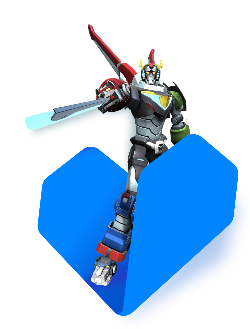
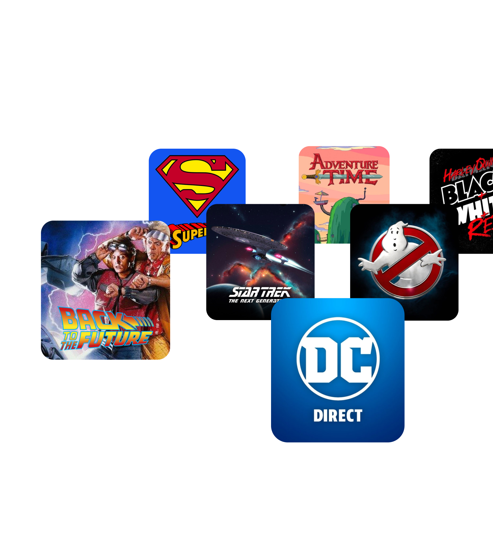
In the space of a few years, VeVe had become a market leader, where collectors from around the world could buy and sell premium licensed digital collectibles from the biggest names in entertainment - Marvel, Batman, DC collectibles, Star Trek, Fast and the Furious and more.
Now at a pivotal point in their journey, they were looking to launch VeVe into its next phase. We began working with them at a strategic level and quickly established the need for a new VeVe brand that truly represented who they’d become.
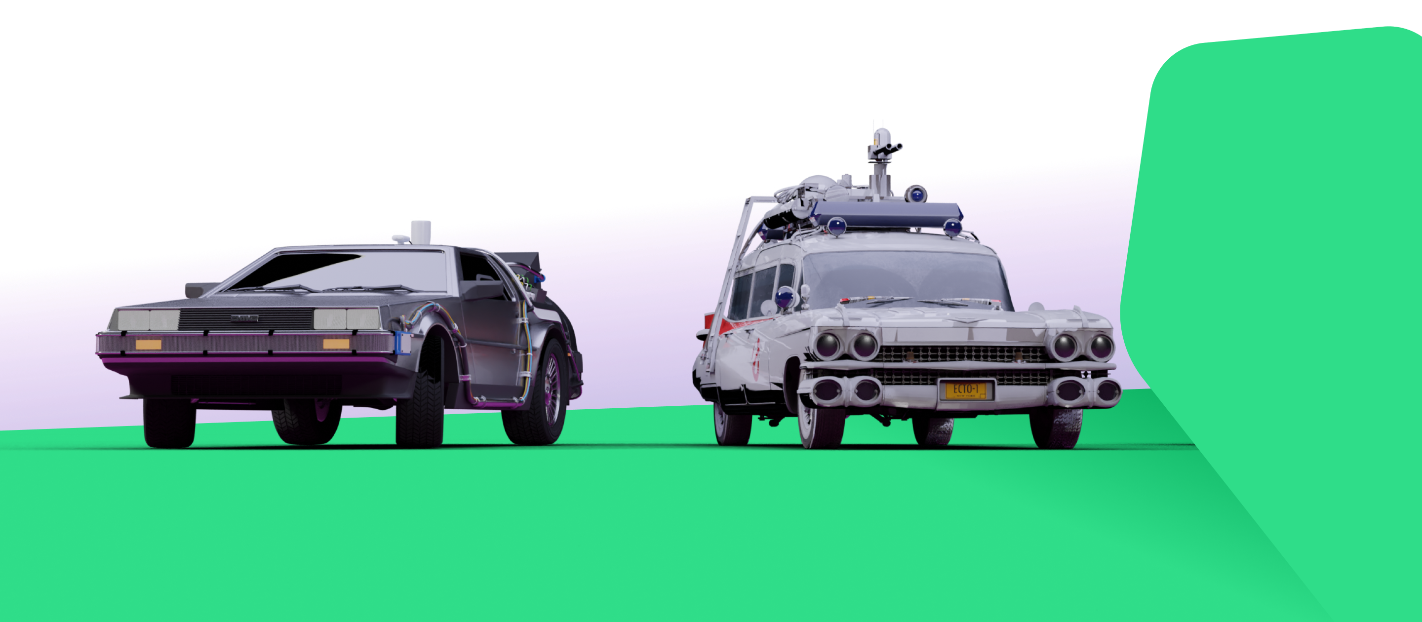
While their existing brand had been fit for purpose in their early days, they now required a bold new visual identity that reflected their unique position in the market, and that would resonate with their existing passionate fanbase while connecting with and inspiring new audiences too. And it needed to be incredibly flexible - able to wrap around a vast range of characters and worlds from Spiderman to Snow White to Star Trek and Jurassic Park, while allowing VeVe to keep expanding and moving into different spaces.
Collecting ideas
The first step to creating a visual representation for VeVe was to explore and define their guiding principles - getting to the heart of their purpose and how they wanted users to experience them.

We began by interviewing stakeholders, encouraging them to articulate the VeVe story in their own words. What emerged clearly was their genuine passion for collecting and for the community around it, and their authenticity. This was their key differentiator against competitors in the NFT and crypto space, and it needed to come through loud and clear in their new brand.
We also asked them to consider their service proposition - thinking of it as a physical product in a physical space and imagining how it would look and feel and how customers would experience it.
Getting personal
Next we took the team through a personality workshop, to define the core attributes of VeVe through a range of questions and activities. They aligned on the qualities: authentic, vibrant, playful and fun. We then used benchmarks to explore and define how these qualities could be brought to life visually.
We also needed to think beyond the current state and ensure we were building a brand robust enough to meet every current and future need. We did this through an architecture workshop, where we mapped out every existing and possible new product their service offering could include.
Throughout these workshops collaboration was key - the VeVe team not only came along for the ride, they helped to shape the journey, seeing themselves and their organisation reflected at every step.
Trying out styles
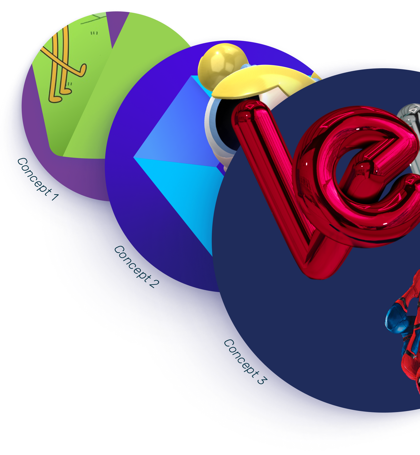
Using this rich information, we then created three distinct style tiles that picked up on different features of the VeVe personality: Authentic, adventurous and passionate.
Finding the heart
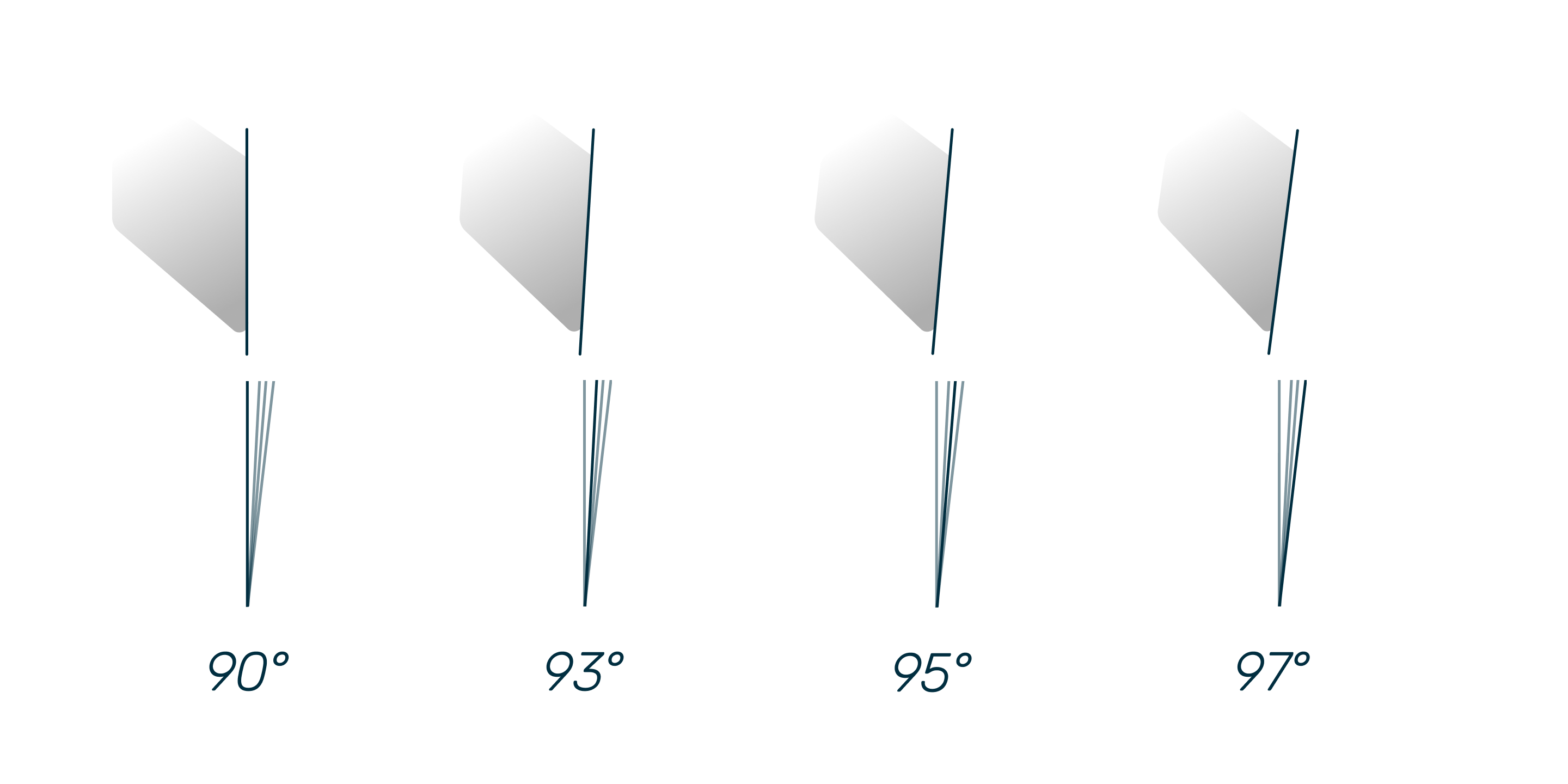
Ultimately the VeVe team decided they wanted to keep close to their roots in the typography while bringing in the form of the gem - the currency used within the platform - and which chimed with their desire to represent the heart of their brand.
Guiding them home
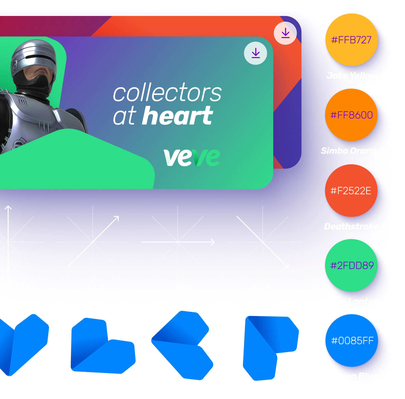
Once we had refined and finalised the new brand, we built out an asset library with guidance on colours, typography, icons and logo use, and templates for every type of internal and external communications. We also created tone of voice guidelines to ensure that the look and feel of the new VeVe identity could be brought to life at every touchpoint. This was all delivered in an online web portal, putting everything the team needed at their fingertips.
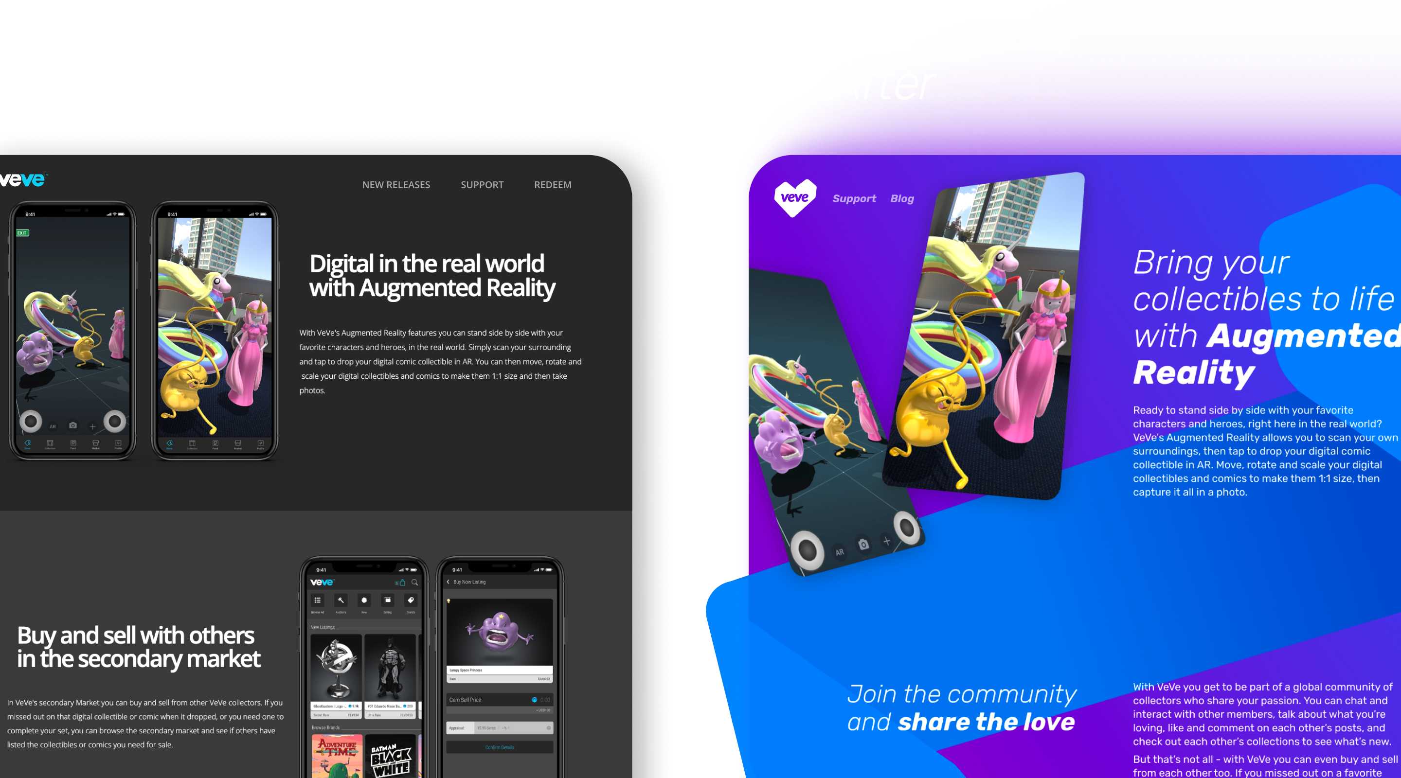
VeVe are now fully equipped with a vibrant, flexible and impactful brand identity that will propel them into the future.
Sharing the love
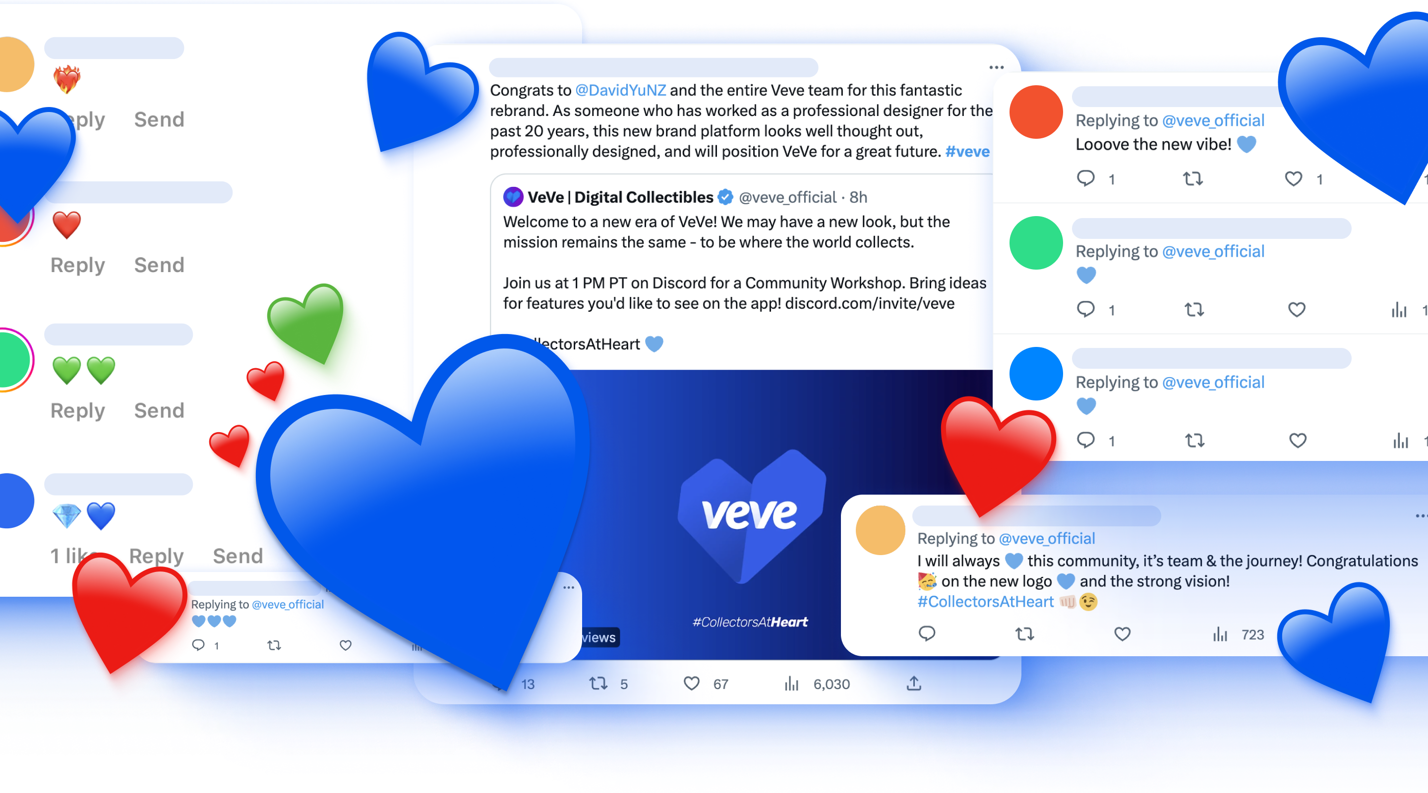
As soon as the brand launched, VeVe fans began responding positively across all their channels - collectively adopting the blue heart emoji as a way to express their love for the new look.
