A time for change
Waitangi Tribunal brand strategy, visual identity and website design
When the Ministry of Justice approached us to design a brand-new website for the Waitangi Tribunal we couldn’t wait to breathe new life into a resource that is so significant to many people in Aotearoa. What ensued was a collaboration with Māori consultants, artists, designers and the eminent members of the Tribunal itself. A fresh identity was created, and part of the journey into te Tiriti o Waitangi and what this means today and for future generations emerged.

The Tribunal and the Treaty
The Waitangi Tribunal exists to make recommendations on claims relating to breaches of te Tiriti o Waitangi.
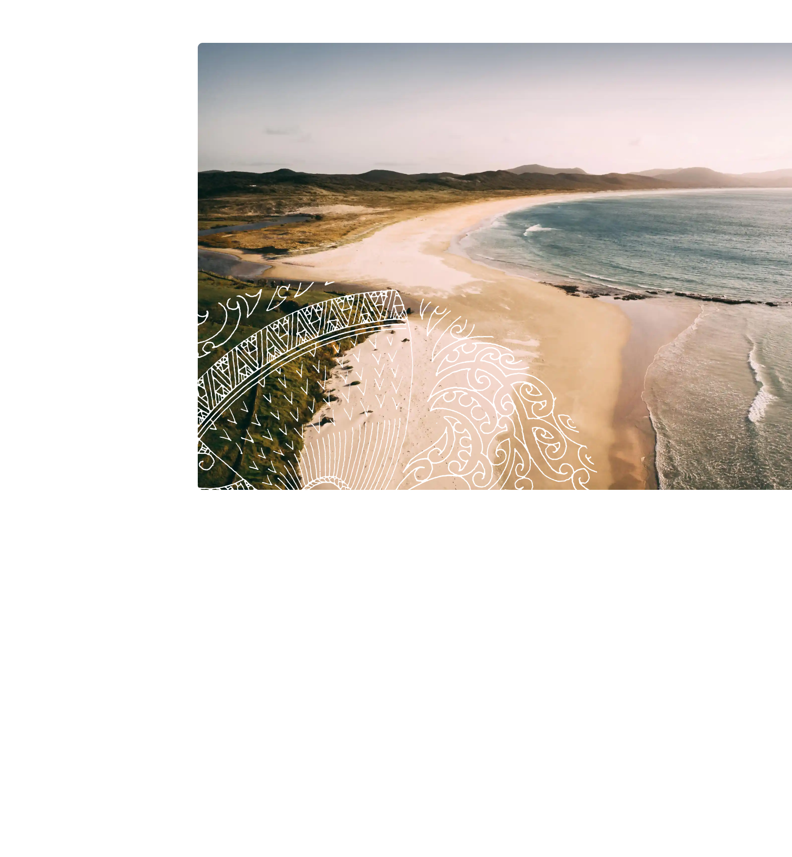
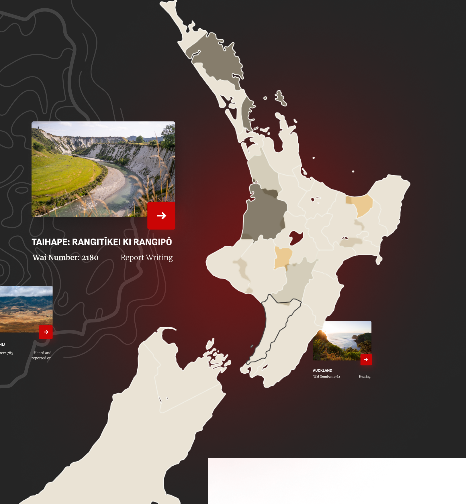
The Tribunal’s website is the destination for anyone wanting to check the status of such a claim, learn about past or future inquiries or simply discover more about te Tiriti, its history and relevance today. With its 50th anniversary approaching, the Tribunal decided it was time to review what it meant to the people of Aotearoa, what the next 25 years might look like and how this could be represented digitally.
A beautiful partnership
On receiving the brief we knew that this was not a job for Alphero alone. We called Skye Kimura, CEO of Māori cultural consultancy Whetumaiangi, who we had worked with many times before. Through our previous partnerships we had developed an approach to mahi that consistently produced great results. Skye was super excited to get on board.
We knew from the outset that this was a design-only project. The Tribunal was already working with Signify on the development and integration of the new site. This is not uncommon for us so we had some robust processes in place to regularly make sure everything we did would work, while retaining everything our client wanted to see in the design.

New life for an old site
We approached the whole project from scratch. The previous website for the Waitangi Tribunal was designed for desktop only and very text heavy. It didn’t really represent te ao Māori nor reflect Te Reo Māori.
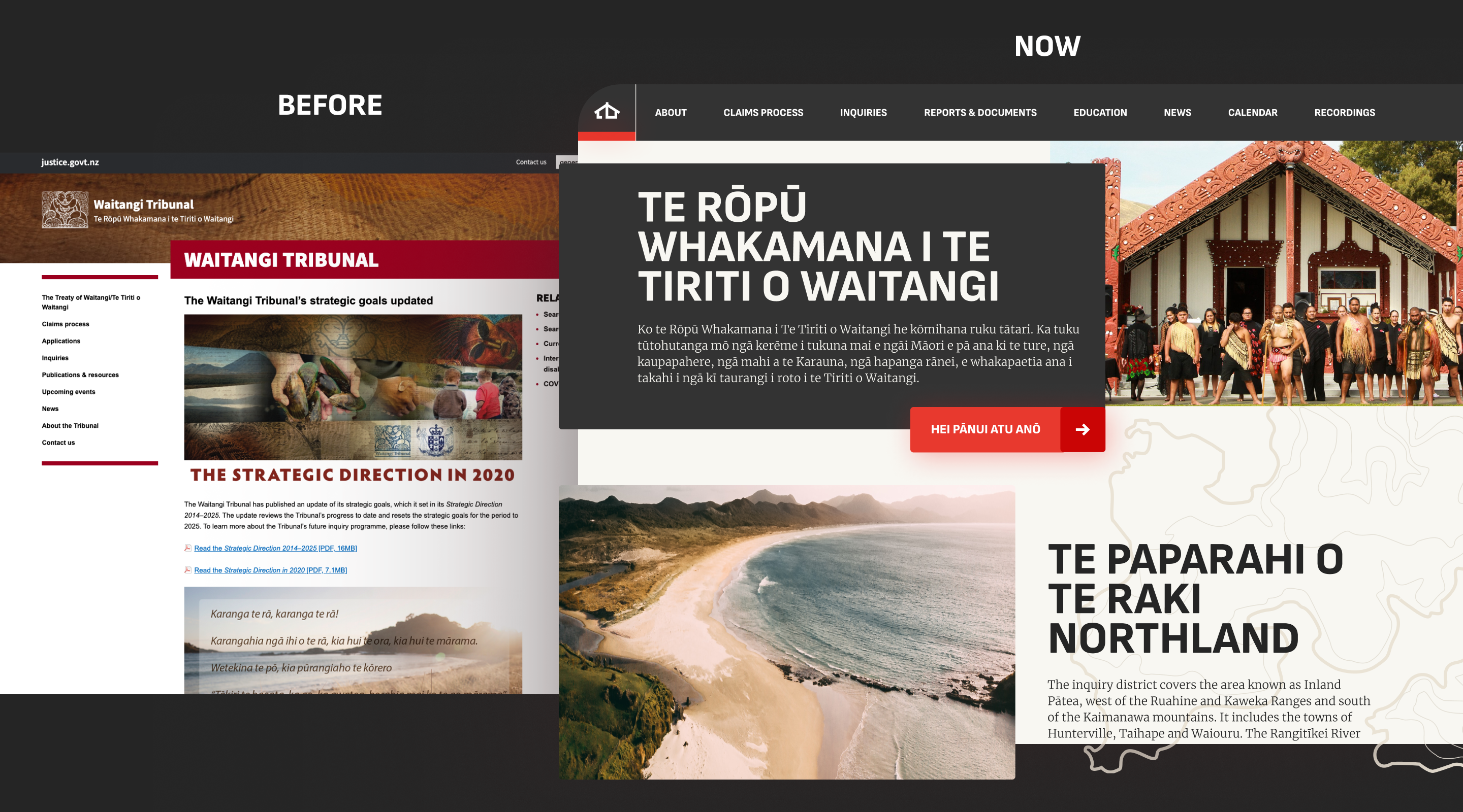
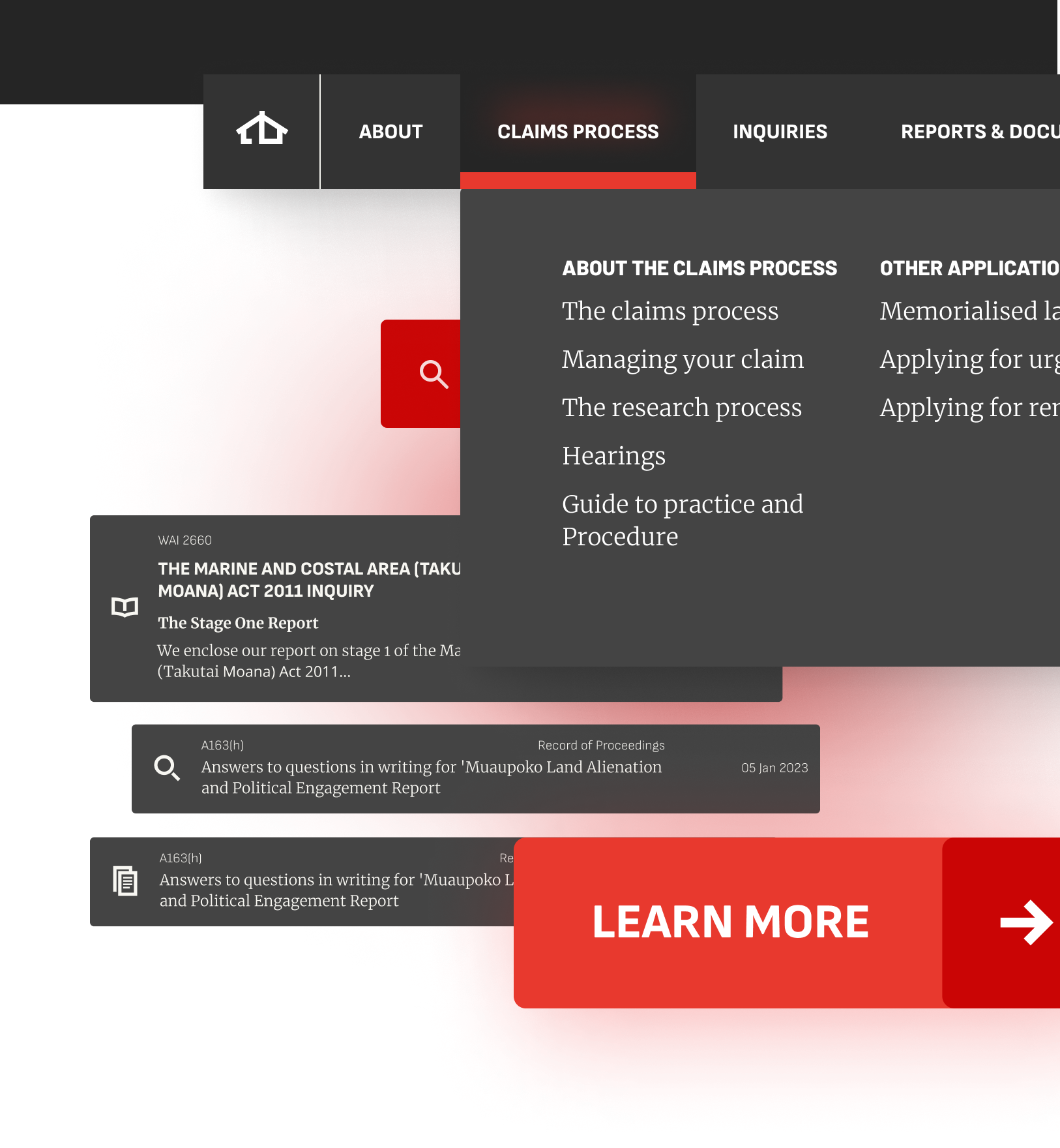
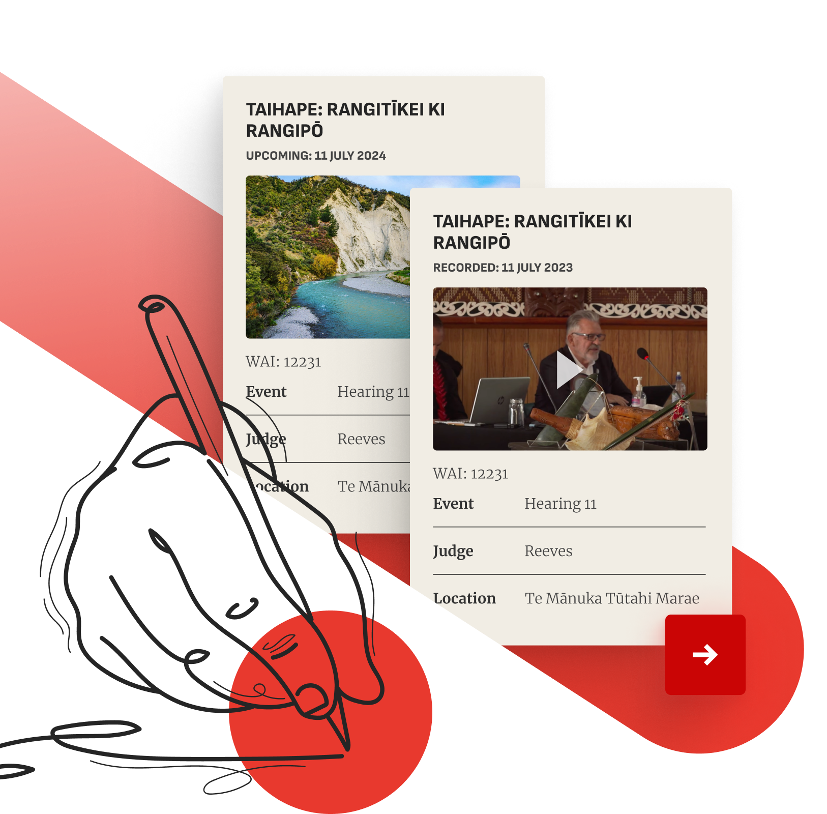
The objective of the old site was to help people around the claims process – how and when to make a claim and how long it takes. The Tribunal wanted the new site to also show the status of claims – whether active, resolved, inactive or historical. It wanted people to be able to refer to successful claims and the documentation required to deliver such a claim.
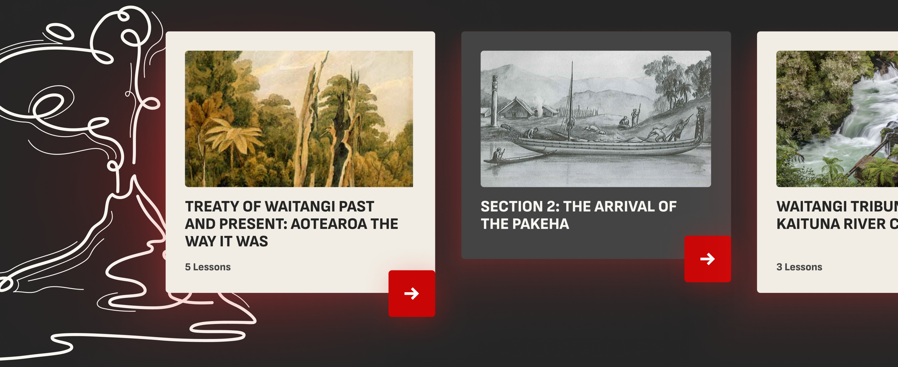
Finally, the Tribunal wanted the site to be an accessible educational resource, helping people understand te Tiriti o Waitangi and why this commission of inquiry exists.
Traversing decades of documents
Some practical challenges lay before us. There was a huge amount of data to be rehomed and served up at the right time without losing context. This included an enormous archive of legal documentation, newsletters and journals from the last four decades. Upcoming and recently concluded inquiries had to be easy to search and accessible for all, and future content in yet to be used formats such as video required consideration – all within a new visual identity.
Gathering insights
Modernising the site was something we could comfortably do. The challenge was making sure everything would be designed with mātauranga Māori firmly top of mind, and this is where Skye’s experience and expertise were invaluable.
We kicked things off by having a kōrero with the main judges at the Waitangi Tribunal. Despite their busy schedules they were generous with their time, committed and forthcoming with what they wanted for the new site.
With Skye’s help we connected with Māori who provided feedback on what te Tiriti means for them now and what it could mean in the future.
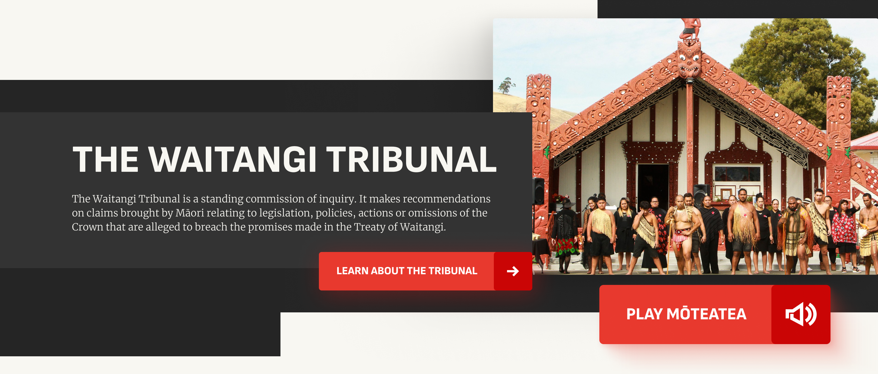
A new landscape
It was clear that the new site had to do more than translate into te reo – that was a given. It also had to represent te ao Māori but still look, feel and sound in a way that resonated with many New Zealanders.
Developing personality
A blank canvas is very exciting for a designer. It’s also very daunting. Extracting the essence of people’s opinions and feelings into a design vernacular is challenging. To overcome this, we took key stakeholders through a brand personality exercise. We explored the Tribunal from a human perspective, giving each judge a board that they used to help articulate how they saw the Tribunal’s character and personality. If the Tribunal were a person, what body shape would it be? How would it speak? How would it move?
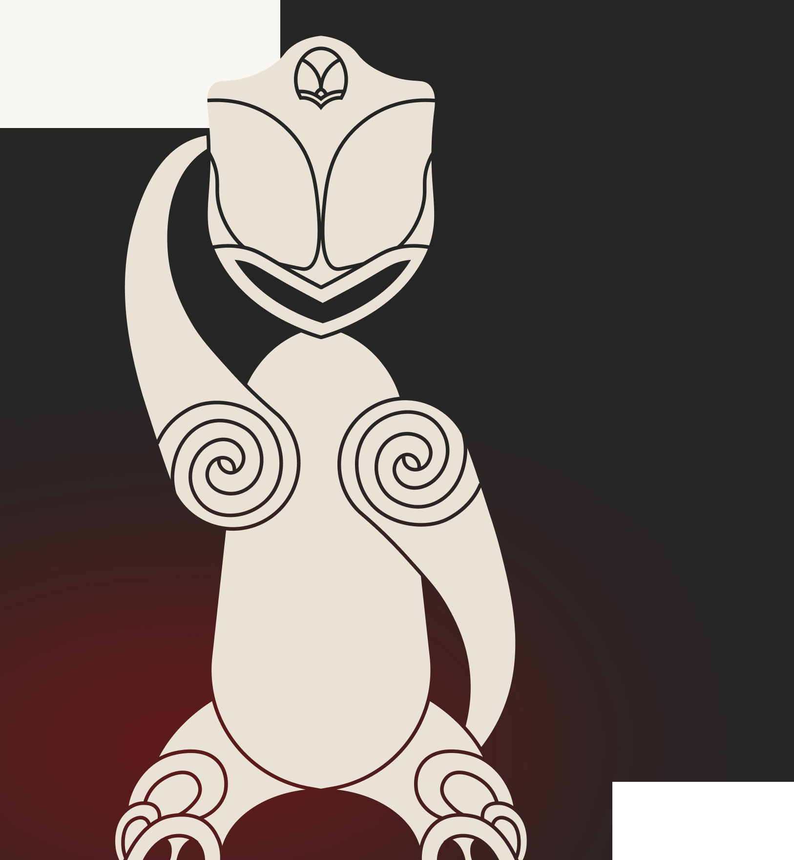
Cultivating identities
An agreed list of personality traits was distilled into three distinct directions: the carer, the leader and the guide. The carer would feel welcoming and safe, using organic forms and earthy tones. The leader would be strong and geometric with black, red and large typography. The guide would traverse landscapes, using typology and a nature-orientated palette.
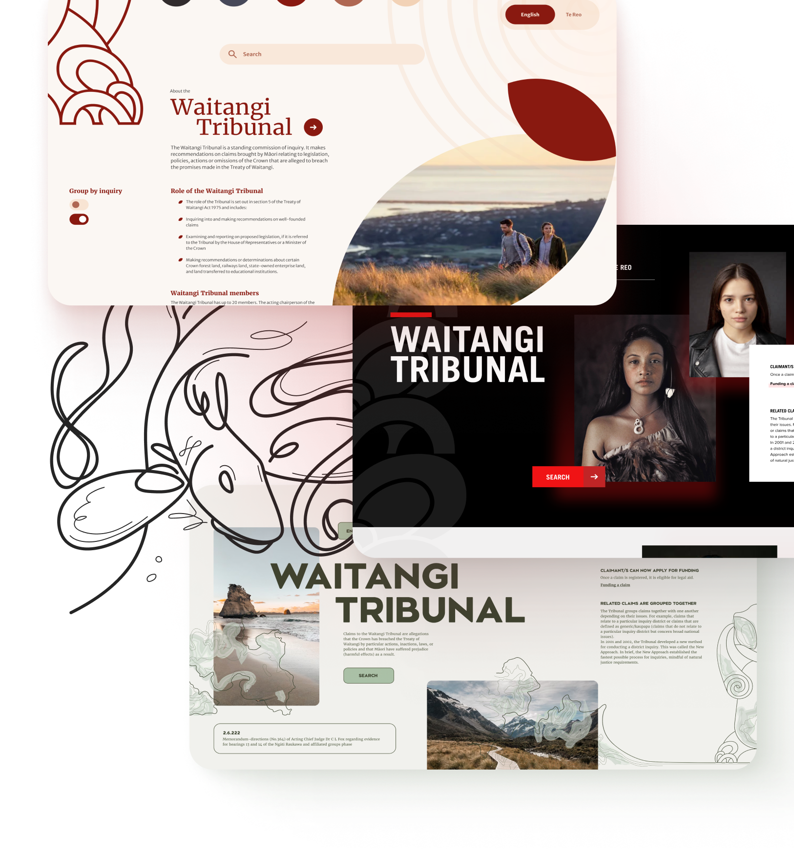
The fruit of our mahi
The two territories that stood out were the leader and the guide with the colours, typography, iconography and buttons reflecting the personality of the leader, and the typological treatment and photographic imagery reflecting the guide. We even illustrated every major land mass or distinct feature of every province in New Zealand. Whenever that area is mentioned, the associated illustration accompanies it.
